In this article, we will explore how to set up buttons programmatically in an Android application. We will cover various aspects such as finding buttons by their IDs, setting click listeners, adding or removing buttons dynamically, enabling or disabling buttons, and showing or hiding buttons programmatically. Additionally, we will delve into customizing the background color, borders, and text attributes of buttons using code. By the end of this article, you’ll have a comprehensive understanding of how to manipulate buttons programmatically in your Android projects. Let’s dive in!
Setup Programmatically
Get Button with FindViewById
All views defined in XML layout can be accessed programmatically by calling the findViewById method. You must however give your view, in this case, your button, an identifier, which can later be accessed with the resource bundle R.id. The following code illustrates how a button can be found with the findViewById method.
val button: Button = findViewById(R.id.buttonId)
val button = findViewById<Button>(R.id.buttonId)
Kotlin also provides additional functionality to access views that are defined in XML without calling the findViewById method.
import kotlinx.android.synthetic.main.YOUR_LAYOUT_NAME.<INFLATED_LAYOUT>


override fun onCreate(savedInstanceState: Bundle?) {
    super.onCreate(savedInstanceState)
    setContentView(R.layout.INFLATED_LAYOUT)

    buttonId.text = "Hello Kotlin!"
}
android {
    ...
    buildFeatures {
        viewBinding true
    }
}
Set OnClickListener
In this section, you will also learn how to react to click events on your button. You will see how to handle these events and will give examples of how to make your button clickable or not clickable, or in other words, enabled and disabled.
Android buttons provide an observer object to which you can register OnClickListener or call-back functions. These functions will be executed every time somebody clicks on this widget. If you want to know how the Listener Pattern works, we suggest having look at our detailed tutorial about this design pattern: Observer Pattern.
You can find several examples of how to register and set a listener in our examples below. All you need to make sure of is to have a valid reference to your view.
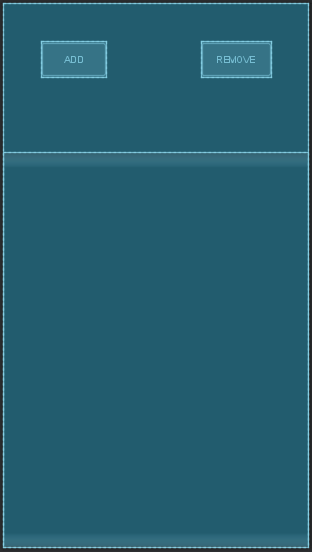
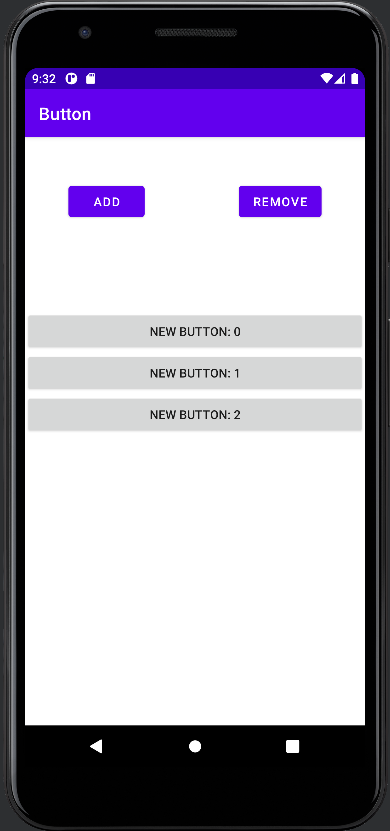
Add / remove button programmatically
As with any widget, buttons can be added or removed programmatically in Kotlin. All you need is a valid layout, in which the button will be added / removed.
In our example below we have defined 2 buttons and one vertical layout in XML. We get the references to these objects via the findViewById method. The click event handler of the addBtn will declare a new button and insert it at the end of the layout. The removeBtn will get the index of the last button in the layout and (if possible) remove it.
Note that we could derive custom classes from the button base class and completely configure our buttons programmatically.
class MainActivity : AppCompatActivity() {

    var addBtn: Button? = null
    var removeBtn: Button? = null
    var listView: LinearLayout? = null

    override fun onCreate(savedInstanceState: Bundle?) {
        super.onCreate(savedInstanceState)
        setContentView(R.layout.activity_main)

        addBtn = findViewById(R.id.addBtn)
        removeBtn = findViewById(R.id.removeBtn)
        listView = findViewById(R.id.listView)

        addBtn!!.setOnClickListener { addButton() }
        removeBtn!!.setOnClickListener { removeButton() }

    }

    private fun addButton() {
        val newButton = Button(this);
        newButton.text = "New Button: " + listView!!.childCount
        listView!!.addView(newButton)
    }

    private fun removeButton() {
        val lastIndex = listView!!.childCount - 1;
        if(lastIndex < 0) return
        listView!!.removeViewAt(lastIndex)
    }
}
Enable / disable button programmatically
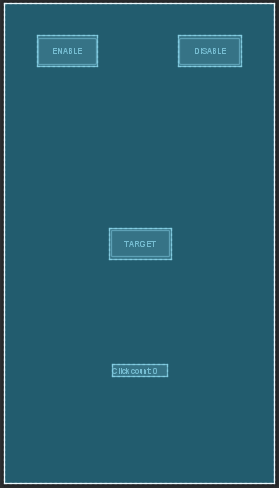
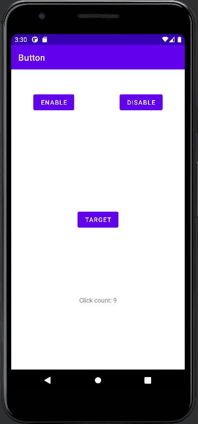
Buttons can be enabled or disabled. Enabled widgets will no longer react to click events, while enable widgets will handle such events. In our example, we have declared 2 buttons in the XML layout. We are getting their references with the findViewById function. On the click event listener of, in the enableBtn we are setting the isClickable property of our target button to true. In the disbledBtn we are setting it to false. The extra text view provides information if the button was clicked.
class MainActivity : AppCompatActivity() {

    var enableBtn: Button? = null
    var disableBtn: Button? = null
    var targetBtn: Button? = null
    var infoText: TextView? = null

    var clickCount = 0

    override fun onCreate(savedInstanceState: Bundle?) {
        super.onCreate(savedInstanceState)
        setContentView(R.layout.activity_main)

        enableBtn = findViewById(R.id.enableBtn)
        disableBtn = findViewById(R.id.disableBtn)
        targetBtn = findViewById(R.id.target)
        infoText = findViewById(R.id.infoText)

        enableBtn!!.setOnClickListener { targetBtn!!.isClickable = true }
        disableBtn!!.setOnClickListener { targetBtn!!.isClickable = false }

        targetBtn!!.setOnClickListener { infoText!!.text = "Click count: " + ++clickCount}
    }
}
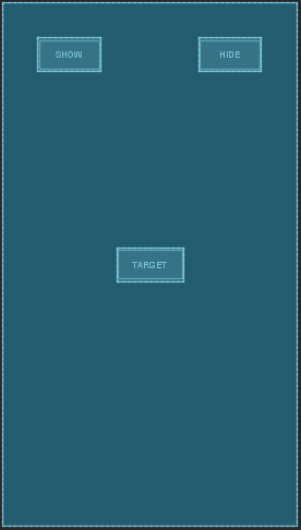
Show / hide button programmatically
Views in Android can be hidden or shown. Their appearance can be controlled with the visibility property. This property needs an interger which defines their state. The integer value can be accessed via static fields in the View class. The table below shows the current integer representation.
In our example, we have created 3 buttons in XML Layout. We get the references as usual with the findViewById function. The showBtn will set the visibility flag of the targetBtn to View.VISIBLE and the hideBtn to View.INVISIBLE, respectively.
| Static Field | Const int Value |
| View.VISIBLE | 0 |
| View.INVISIBLE | 4 |
class MainActivity : AppCompatActivity() {

    var showBtn: Button? = null
    var hideBtn: Button? = null
    var targetBtn: Button? = null

    override fun onCreate(savedInstanceState: Bundle?) {
        super.onCreate(savedInstanceState)
        setContentView(R.layout.activity_main)

        showBtn = findViewById(R.id.showBtn)
        hideBtn = findViewById(R.id.hideBtn)
        targetBtn = findViewById(R.id.target)

        showBtn!!.setOnClickListener { targetBtn!!.visibility = View.VISIBLE }
        hideBtn!!.setOnClickListener { targetBtn!!.visibility = View.INVISIBLE }
    }
}
Background
Android provides functionality to define your background of your button either in XML or programmatically in code.
Background Color
One common use case is to change the default color of an Android button. You can do this either in XML by setting the desired property. The alternative is to get a reference of your button programatically and then set the background color with the setBackgroundColor function of the object. You can get a reference of this object if it is created in XML by using the findViewById method.
Android offers several ways to create colors. We will show you with examples how to create a color from different color codes.
RGB
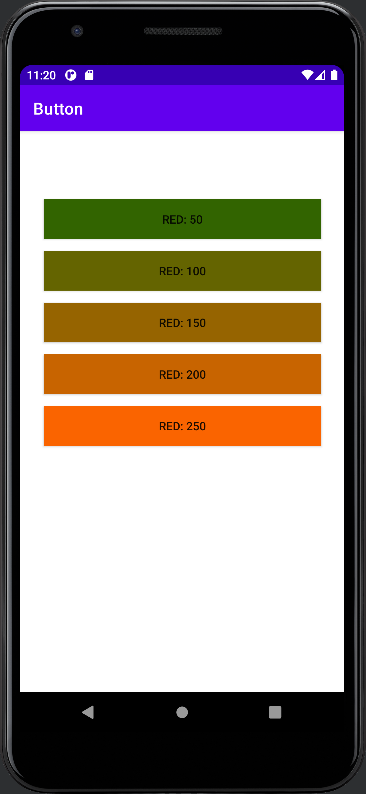
RGB color codes are the most common representations of colors. Android offers 2 overload functions of Color.rgb(). The first accepts integer values with a range from 0 to 255. The other accepts floating point values in a range from 0 to 1.0. In our example we adapt the red channel of the background color.
RGBA
RGBA or in Android ARGB is just like RGB color codes but with an additional channel for transparency. If you don’t need transparency we recommend using RGB values directly, as RGBA uses more memory. However, you can use this option to create a fully transparent button as shown below.
HEX
An alternative to RGB values is to use directly the HEX color code. You can parse the color object with the function Color.parseColor(string) which accepts the hex color code as shown below.
private fun createButton(red: Int) : Button {

    var button = Button(this);
    button.layoutParams = createParams()
    button.text = "Red: $red"

    var color = Color.rgb(red, 100, 0)
    button.setBackgroundColor(color)
    return button
}
private fun createButton(red: Int) : Button {
var button = Button(this);
button.layoutParams = createParams()
button.text = "Red: $red"
var color = Color.argb(255, red, 100, 0)
button.setBackgroundColor(color)
return button
}private fun createButton(hex: String = "#646400") : Button {
var button = Button(this);
button.layoutParams = createParams()
button.text = "Hex: $hex"
var color = Color.parseColor(hex)
button.setBackgroundColor(color)
return button
}Transparent Background Color
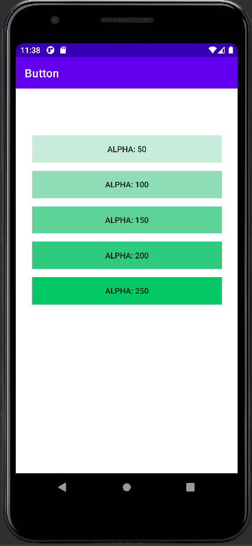
The easiest way to set programmatically a transparent background color is to use an RGBA color, where the alpha channel is 0. This will create a completely transparent color. In the example below you will see the effect of different alpha channels.
private fun createButton(alpha: Int) : Button {

    var button = Button(this);
    button.layoutParams = createParams()
    button.text = "Alpha: $alpha"

    var color = Color.argb(alpha, 0, 200, 100)
    button.setBackgroundColor(color)

    return button
}
Another option is to adapt the alpha channel directly on the Background drawable. The drawable object provides a property alpha which can be set to 0 for full transparency. The result is the same as using RGBA values. This method is the preferred way if you don’t want to create new extra colors.
private fun createButton(alpha: Int) : Button {

    var button = Button(this);
    button.layoutParams = createParams()
    button.text = "Alpha: $alpha"

    var color = Color.rgb(0, 200, 100)
    button.setBackgroundColor(color)
    button.background.alpha = alpha

    return button
}
Border
Defining the border of a button in Android can be quite a challenge. Especially if you want or need to do it programmatically. To setup correctly your border, you first need to have a reference to your button. You can either find an existing button, which is defined in XML Layout with the findViewById function or you can create a new one directly in your Kotlin code.
Afterward you need to define manually the background. The background property accepts a Drawable object. You can create a new one or use existing ones from the Android ecosystem.
Set Border Width programmatically
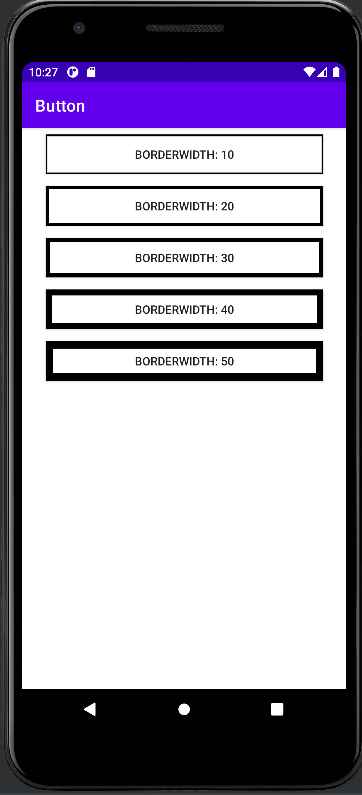
As an example how to set the border width programmatically in code, you can use a ShapeDrawable. In our example, we use such a drawable with an actual rectangle shape. The drawable exposes a paint instance that finally exposes properties to change border width. The property to set the border width programmatically is the strokeWidth property on the paint instance.
In the code example below we have created a linear layout in XML. In Kotlin code we reference (by findViewById) and it in a for-loop 5 buttons. Each button has a different border width. The result can be seen in the next image.
class MainActivity : AppCompatActivity() {

    var listView: LinearLayout? = null

    override fun onCreate(savedInstanceState: Bundle?) {
        super.onCreate(savedInstanceState)
        setContentView(R.layout.activity_main)

        listView = findViewById(R.id.layout)

        for (strokeWidth in 1..5) {
            listView!!.addView(createButton(strokeWidth * 10))
        }
    }

    private fun createButton(borderWidth: Int) : Button {

        var button = Button(this);
        button.layoutParams = createParams()
        button.background = createBorderBackground(borderWidth)
        button.text = "BorderWidth: $borderWidth"

        return button
    }

    private fun createParams() : ViewGroup.LayoutParams {
        var left = 100
        var right = 100
        var top = 20
        var bottom = 20

        val params = ConstraintLayout.LayoutParams(
            ConstraintLayout.LayoutParams.MATCH_PARENT,
            ConstraintLayout.LayoutParams.WRAP_CONTENT
        )
        params.setMargins(left, top, right, bottom)
        return params
    }

    private fun createBorderBackground(borderWidth: Int) : Drawable {
        val shapeDrawable = ShapeDrawable()
        shapeDrawable.shape = RectShape()
        shapeDrawable.paint.color = Color.BLACK
        shapeDrawable.paint.style = Paint.Style.STROKE
        shapeDrawable.paint.strokeWidth = borderWidth.toFloat();

        return shapeDrawable
    }
}
Set Border Radius / Corner Radius programmatically
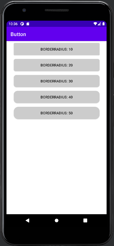
Similar to the border width, the border-radius can be programmatically defined. This is the use case to create round corners. First, you need as well access to the correct drawable, which will be the background of our button. In this case, we are using a GradientDrawable, as it exposes the property cornerRadius property. Similar to the previous code we are creating several views and modifying the border-radius programmatically. The result can be seen in the next image.
class MainActivity : AppCompatActivity() {

    var listView: LinearLayout? = null

    override fun onCreate(savedInstanceState: Bundle?) {
        super.onCreate(savedInstanceState)
        setContentView(R.layout.activity_main)

        listView = findViewById(R.id.layout)

        for (borderRadius in 1..5) {
            listView!!.addView(createButton(borderRadius * 10))
        }
    }

    private fun createButton(borderRadius: Int) : Button {

        var button = Button(this);
        button.layoutParams = createParams()
        button.background = createBorderBackground(borderRadius)
        button.text = "BorderRadius: $borderRadius"


        return button
    }

    private fun createParams() : ViewGroup.LayoutParams {
        var left = 100
        var right = 100
        var top = 20
        var bottom = 20

        val params = ConstraintLayout.LayoutParams(
            ConstraintLayout.LayoutParams.MATCH_PARENT,
            ConstraintLayout.LayoutParams.WRAP_CONTENT
        )
        params.setMargins(left, top, right, bottom)
        return params
    }

    private fun createBorderBackground(borderRadius: Int) : Drawable {

        var gradientDrawable = GradientDrawable()
        gradientDrawable.cornerRadius = borderRadius.toFloat()
        gradientDrawable.setColor(Color.LTGRAY)

        return gradientDrawable
    }
}
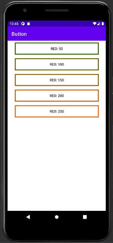
Set Border Color programmatically
The border color of an Android button can be programmatically modified just like the border width. You can use a ShapeDrawable as it exposes the paint instance. On the paint instance, you can set the color directly on the property.
class MainActivity : AppCompatActivity() {

    var listView: LinearLayout? = null

    override fun onCreate(savedInstanceState: Bundle?) {
        super.onCreate(savedInstanceState)
        setContentView(R.layout.activity_main)

        listView = findViewById(R.id.layout)

        for (strokeWidth in 1..5) {
            listView!!.addView(createButton(strokeWidth * 50))
        }
    }

    private fun createButton(red: Int) : Button {

        var button = Button(this);
        button.layoutParams = createParams()
        button.background = createBorderBackground(red)
        button.text = "Red: $red"

        return button
    }

    private fun createParams() : ViewGroup.LayoutParams {
        var left = 100
        var right = 100
        var top = 20
        var bottom = 20

        val params = ConstraintLayout.LayoutParams(
            ConstraintLayout.LayoutParams.MATCH_PARENT,
            ConstraintLayout.LayoutParams.WRAP_CONTENT
        )
        params.setMargins(left, top, right, bottom)
        return params
    }

    private fun createBorderBackground(red: Int) : Drawable {

        val shapeDrawable = ShapeDrawable()
        shapeDrawable.shape = RectShape()
        shapeDrawable.paint.color = Color.rgb(red, 100, 0)
        shapeDrawable.paint.style = Paint.Style.STROKE
        shapeDrawable.paint.strokeWidth = 20.0f

        return shapeDrawable
    }
}
Text
The button instance provides several functions to change its properties. In the following step, we will provide some examples of how to change the most common attributes of an Android button.
The most obvious one is of course how to change the text. You can see this in most of the examples on this page. Just set the desired text with the property access text. Of course, you can use as well the setText function. The same property can be used if you want to get the current button text.
Set Text Color programmatically
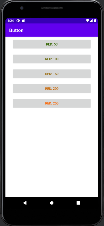
The text color is as well easy to be changed once you have the instance of your button. You can call the setTextColor function to set the desired color to your button. In the code below, we use the same setup as in the previous example. For every step in the for-loop, we increase the red part of the RGB color. You can see the result in the image below. The setTextColor function can be used to see the button text color programmatically.
private fun createButton(red: Int) : Button {

    var button = Button(this);
    button.layoutParams = createParams()
    button.text = "Red: $red"
    button.setTextColor(Color.rgb(red, 100, 0))

    return button
}

private fun createParams() : ViewGroup.LayoutParams {
    var left = 100
    var right = 100
    var top = 20
    var bottom = 20

    val params = ConstraintLayout.LayoutParams(
        ConstraintLayout.LayoutParams.MATCH_PARENT,
        ConstraintLayout.LayoutParams.WRAP_CONTENT
    )

    params.setMargins(left, top, right, bottom)
    return params
}
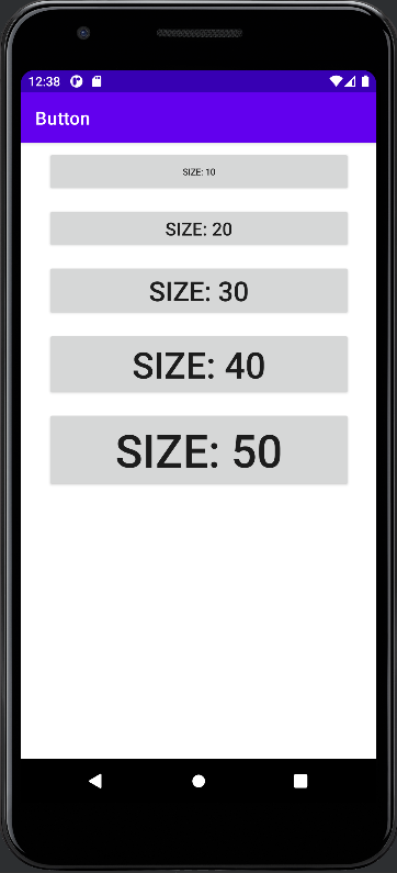
Set Text Size / Font Size programmatically
The following code snipped illustrates how to change the fontsize of the button text programmatically. It uses the same setup as in the previous example. In every loop, the size is increased and set to the new button. The result can be seen in the previous image.
private fun createButton(size: Int) : Button {

    var button = Button(this);
    button.layoutParams = createParams()
    button.text = "Size: $size"
    button.textSize = size.toFloat()

    return button
}